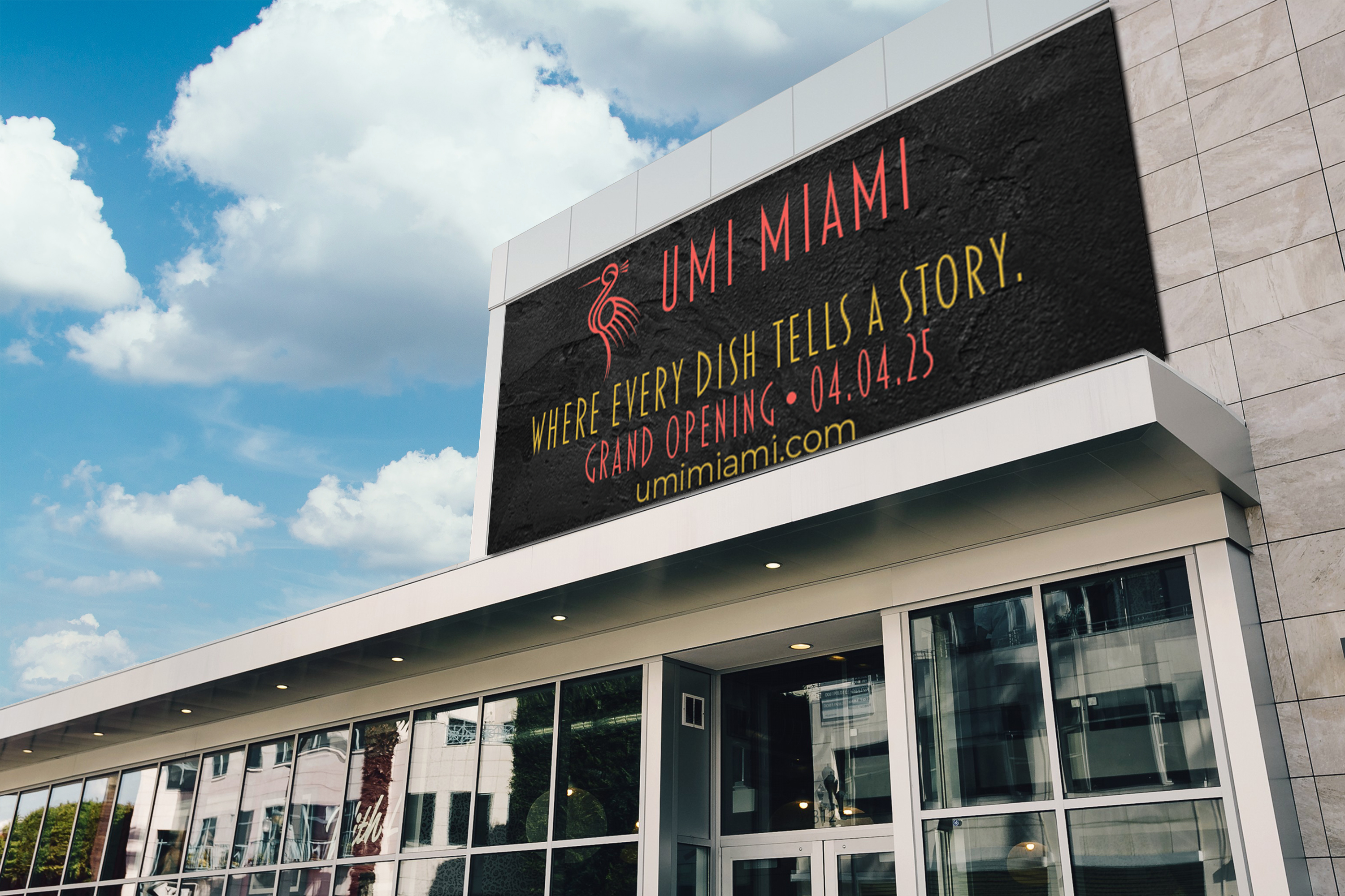
This page outlines the design development for UMI Miami, a premium sushi and Japanese fusion brand. The identity blends modern luxury with cultural symbolism, aiming to stand out in a competitive upscale dining space.
Client:
UMI Miami
Objective:
Build a refined, bold brand identity that speaks to high-end dining and cultural fusion.
Focus Area:
-Integrating Art Deco influences with Japanese aesthetics
-Creating strong, flexible visuals across digital and physical branding
-Crafting a distinct, recognizable presence in the hospitality space
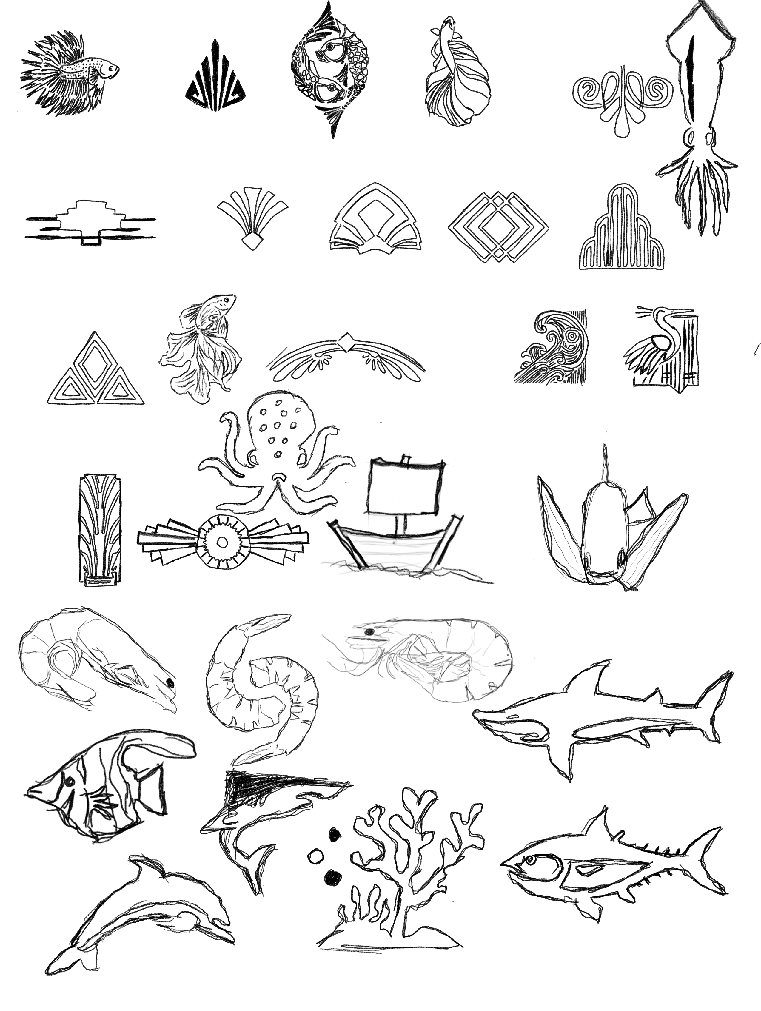
-Brainstorming focused on symbolism, typography, and cultural patterns.
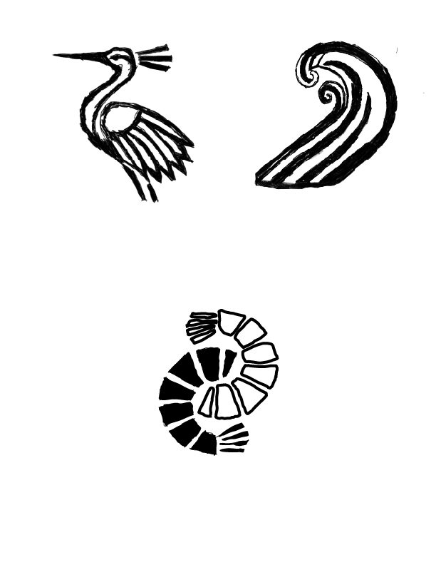
-Early sketches featured crane silhouettes, stylized wave forms, and layered geometry.
-Themes of balance, movement, and sophistication began to emerge.
Target audience:
-Young professionals, foodies, and upscale diners.
Brand keywords:
-Bold, modern, elegant, culturally rich.
Direction set:
-Bold crane symbol with Miami-inspired color and Deco elements.
Competitive analysis revealed a gap between minimalist sushi brands and overdone fusion visuals.
-Three distinct directions were narrowed to one: a stylized crane paired with a modern Art Deco typeface.
-Explored brand tone through typography, shape language, and motion.
-Developed variations for icon placement, line weight, and scale.
Adjustments were made based on clarity, visual rhythm, and emotional tone.
Layouts and elements were tested for visual balance and brand consistency.
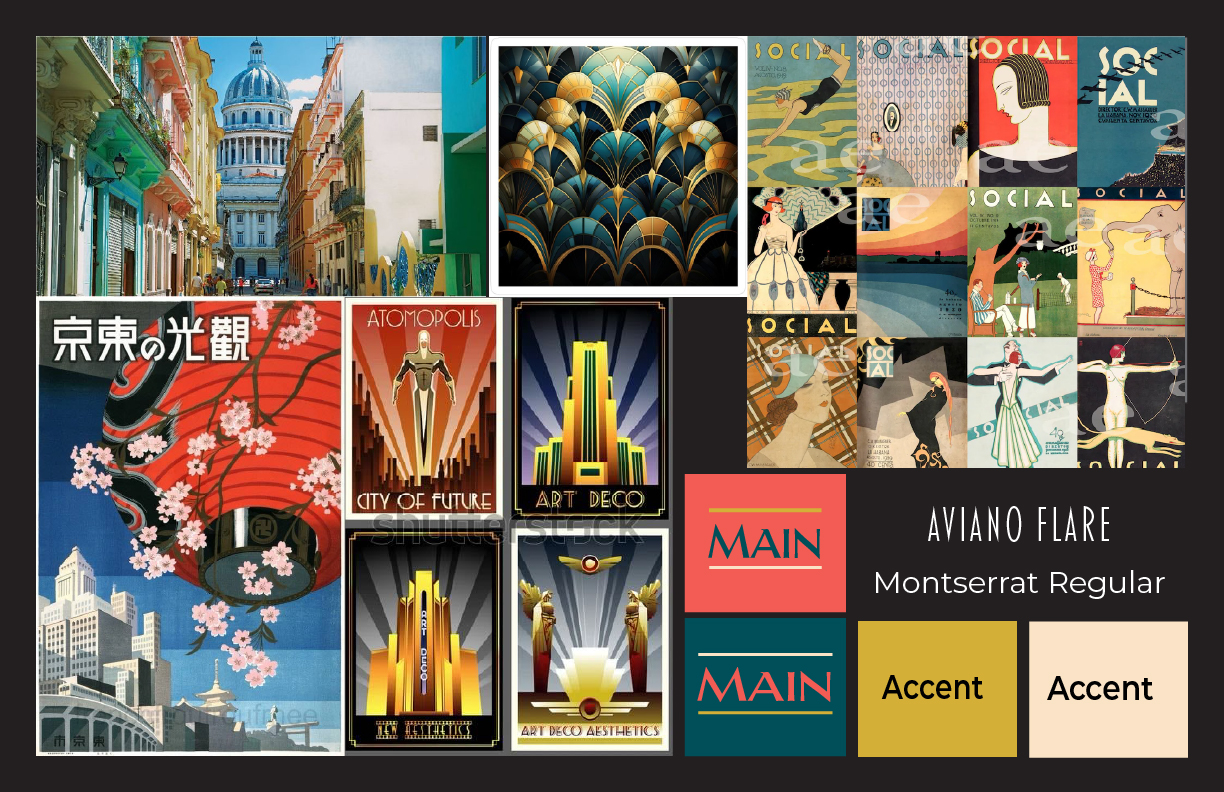
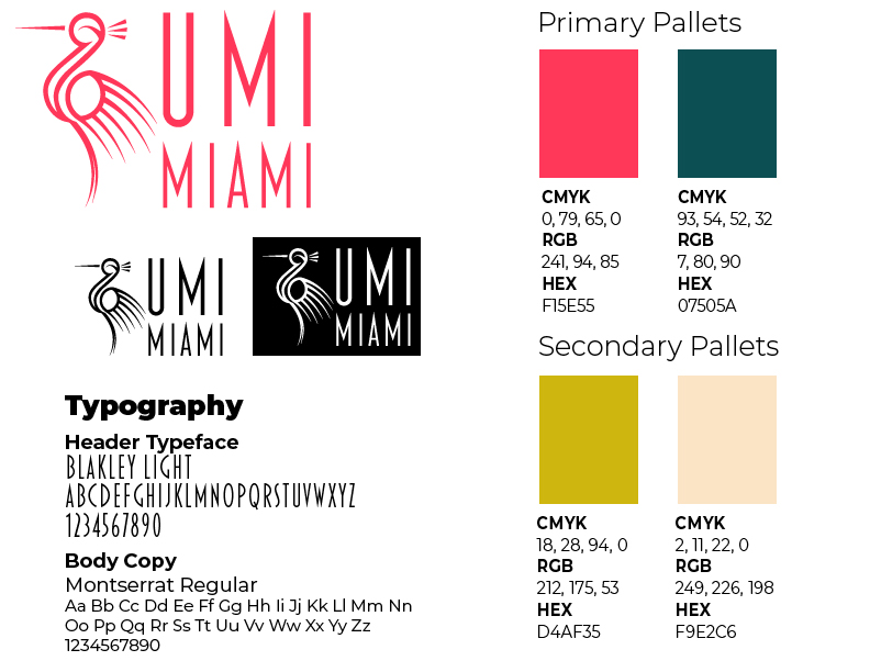
Typeface:
-Aviano Flare used for luxury and contrast, Montserrat for accessibility
Palette:
-Coral red (energy), deep green (depth), and cream (warmth and softness)
Visual system built for versatility, scales across merchandise, signage, and digital platforms
Identity elements include icon, wordmark, custom patterns, and brand applications.
Cohesive styling across all touchpoints maintains a bold, elevated feel.
-The crane icon and custom typography were refined for balance and clarity.
-Visuals were optimized for contrast, scalability, and memorability.
-The brand identity system includes logo, business collateral, promotional items, and advertising designs