

I redesigned the cover for by Stephen King (writing as Richard Bachman), one of my all-time favorite books. The assignment asked us to reimagine a cover that better captured the book’s tone. I focused on creating a bold, emotional design that matched the psychological pressure, exhaustion, and bleakness at the heart of the story. I handled everything from concept to layout.
The original cover didn’t reflect the emotional tension or the mental and physical strain the characters go through. I wanted to fix that by creating something stark and powerful, something that looked like the story felt.
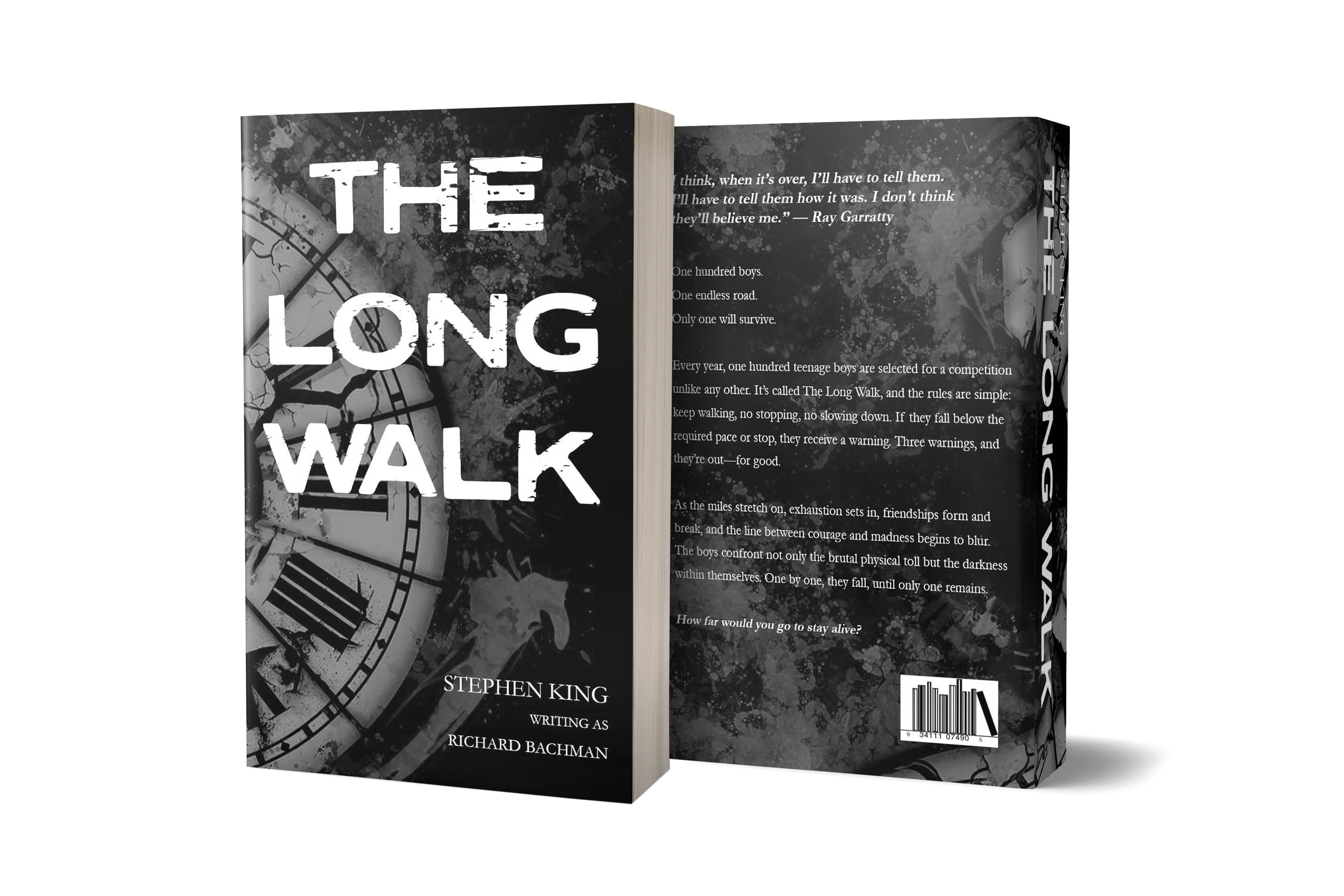
I started with the idea of time, how every second matters in the book. That led to the cracked clock, which became the main visual. I used a distressed typeface to add grit and urgency, and a black-and-white palette to reflect the bleak mood. On the back, I kept things minimal but textured, using faint silhouettes and grunge elements to keep the atmosphere heavy. I wrapped it all into a 3D mockup to show how it would look on a real shelf.
The final design feels intense and stripped down. The broken clock represents the constant countdown and pressure to survive. The raw typography and rough textures push that idea even further. The back cover stays clean but moody, helping the whole piece feel unified and deliberate.
This project hit close to home. Designing for a story I care about made the work feel personal and rewarding. It also helped me see how small design choices, like texture, font, and layout, can tell part of the story. If I had more time, I might try a blood-red variant or a full wraparound scene, but I’m proud of how strong and focused this version turned out.
 BACK
BACK