

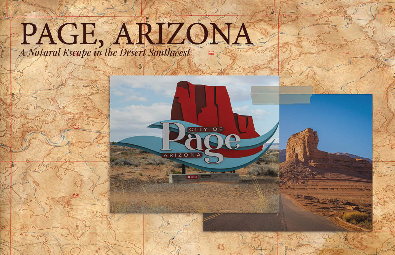
I created this multi-page brochure for a travel design assignment. We were asked to choose a destination and build a full guide from scratch. I picked Page, Arizona, famous for its red rocks, slot canyons, and the nearby Colorado River. I handled every part of the project, from layout design and photo selection to writing copy that captured the area's adventurous vibe and cultural depth.
The brochure needed to stand out in places like visitor centers and airports, somewhere a traveler might spot it and feel pulled in. My challenge was to blend eye-catching visuals with clear, helpful content that worked for a broad audience.
The final brochure looks and feels like something you’d actually pick up on a road trip. It flows smoothly from cover to back page, mixing type, color, and imagery to guide readers through the experience. It doesn’t just list destinations, it invites people to explore them.
The final brochure looks and feels like something you’d actually pick up on a road trip. It flows smoothly from cover to back page, mixing type, color, and imagery to guide readers through the experience. It doesn’t just list destinations, it invites people to explore them.
This was one of my favorite print projects. I got to bring together research, layout, and storytelling in a way that felt real and functional. It pushed me to think more about visual hierarchy and how design choices impact how people read. If I revisit this piece, I’d love to add a fold-out map or QR codes for tours and travel tips.
 BACK
BACK